Not everyone is good at their job, but the designers of some of these products and items took incompetency to an entirely new level. Somehow these totally ridiculous design fails made it past multiple sets of approvals, despite the potentially problematic end results. Whether they are comical, offensive, or inappropriate, these epic blunders show the importance of looking over a design one final time before sharing it with the whole world. For some seriously unfortunate designs that people actually paid good money for, read on!
Kelly Vandan
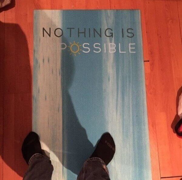
When Nothing Is Both Impossible and Possible
Yoga is usually associated with positive energy and vibes while also promoting relaxation and consciousness. It is rarely known to be a disheartening and discouraging activity and no one wants you to finish your yoga experience with negative energy. Although the designers of this yoga mat almost certainly meant for this to be a positive message for their users, saying that "nothing is impossible", their poorly placed white stripe on the side left everyone with a very different message.

Hopefully, it was only this one yoga mat that ended up with the white stripe so horribly placed. If not, and the entire batch was affected, then someone missed a very important design aspect!
Making a Show of Your Trip to the Bathroom
Come one, come all and see the wonders of....a very interesting and almost certainly shocking (and smelly) show. It's unlikely anyone will be bringing along popcorn and snacks for this strange performance. Really though, what were these designers thinking? If this wasn't a seriously silly mistake, these people have some odd interests. You would think they'd at least consider adding in a curtain, to shield the onlookers from the more disturbing aspects of this show.
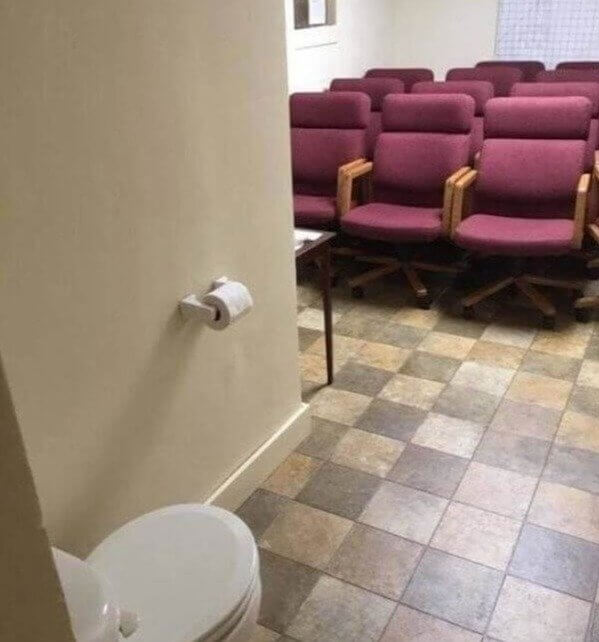
Even if this toilet is never used while entertaining a full house of guests in these plush maroon chairs, there are still many questions as to why it is not more properly concealed.
His Shirt Quickly Went From Dope to Pedo
It was probably a really good idea, on paper. But when these designers brought their "dope" idea to fruition, they were either shocked or oblivious to the unfortunate appearance of the end result. What started out as a very cool idea quickly downward spiraled into a less appealing one. After all, no one wants to walk around all day with a shirt that, at first glance, could appear to spell out "pedo" instead of dope.

If you look at the letters in a word search form, you can find some even more unfortunate words in the mix. Both "Peed" and "Oop" (although the latter is not really a word) are also certainly not shirt message material.
Would You Like Some Chips With a Side of Chips?
Fish and chips are a beloved dish all around the world. But have you ever considered the option of removing the fish and just ordering some chips? Or you could have chips...without chips. Or chips with a side of chips. Whatever was trying to be portrayed on this graph-like menu with different price options, got a little fishy when it came to the chips section. Maybe they should have left the chips out of this altogether.
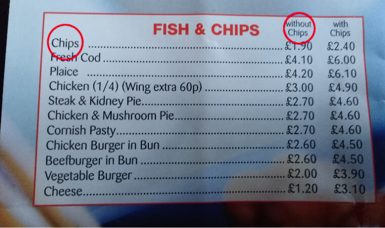
Everyone's attention immediately is focused on the suspicious chips situation on the menu, that you may overlook the strange option of having cheese (only cheese) with or without a side of chips.
A Little Apostrophe Makes a Whole of Difference
Who thought that an apostrophe could be so incredibly important? It doesn't look like Anu (and her kitchen) understood how much they should have emphasized this little grammatical addition when it came to designing the signs for their new restaurant. We would assume there isn't a single person in the world who would want to associate their food with what Anu's kitchen would be without that little apostrophe.

Imgur
This apostrophe has quite a big responsibility for such a little guy. Without him, Anu wouldn't have a business at all (even with him, it's not guaranteed that they do).
That's One Foxy Fox
Foxes are known to be mischievous little creatures. But who would have thought that they would also be so clever when it came to causing havoc during your morning cup of coffee. Maybe they don't like the idea of being used as a cute and creative little holder for hot drinks and their way of revenge is to lightly stab the eyes of whoever tries to take a simple sip.
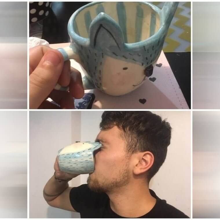
This is a prime example of someone who had a great idea but simply did not think to test it out before mass producing it and sending it out to the world.
Drive or Die
fairly
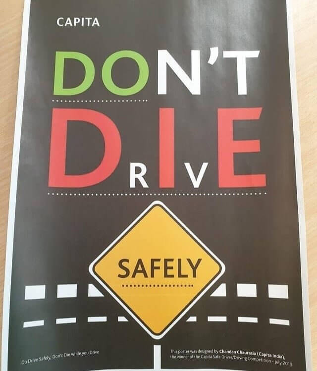
To summarize all the options of messages this sign could be trying to portray, there is "do die safely", "don't drive safely", "don't die safely", or "do drive safely". Of which, only the last one would make any possible sense.
A Banana in a Bag
Besides the obvious environmental qualms with such packaging, these individually wrapped bananas are positively pointless. A banana has a naturally built-in "wrapper". Why would anyone think they needed to add an additional layer of artificial protection and nonenvironmentally-friendly waste? Also, if you're already going to buy multiple bananas, why separate them? Nature's packaging is usually good enough and there's no need to keep all the bananas alone and lonely.
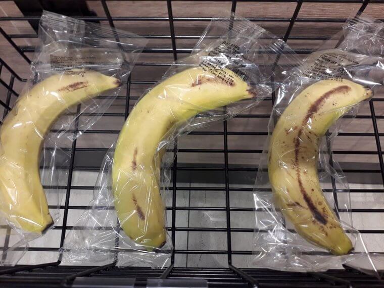
All this wasted plastic is not only very bad for the environment, but also most likely damages the freshness and taste of the bananas themselves. Overall, it is an unnecessary and wasteful packaging choice.
The Power of a Sliding Window
What started out as a pretty picture of a lady advertising something or another on the side of this train, quickly turned into a disturbing and hilarious image of a bug-eyed woman with roaming bobblehead-like features. Clearly, the designers of this ad didn't think about the possibility of their model's eyes moving with the windows. Or perhaps they finally understood why they managed to get such a cheap deal from the train company.
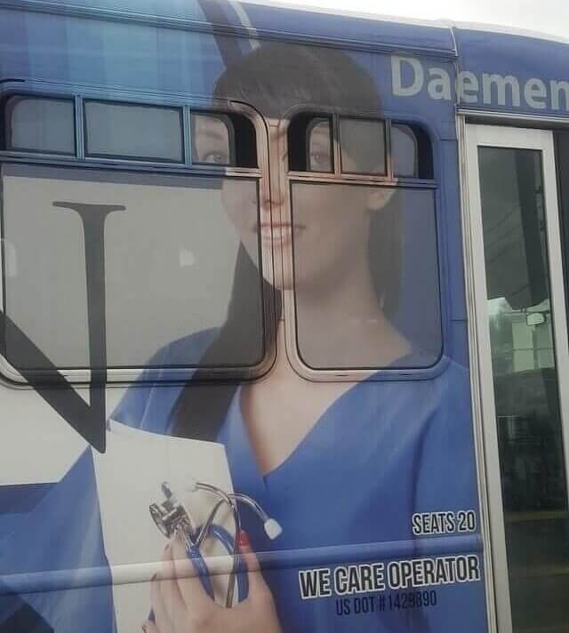
Although certainly comical and most likely not what the original advertisers had imagined when they sought out to purchase some ad space, this picture definitely caught the eye of some additional potential clients (pun intended).
The Sticker Hides All the Secrets
No one wants to see what disturbing events are going down behind the protection of this sticker. That red M&M seems just a little bit too happy with the entire situation. It's hard to tell, but from the looks of it, there may even be another set of legs in this scene, complicating the situation even more. The original image itself is most likely entirely innocent, but that sticker still seems to be concealing something far less so.
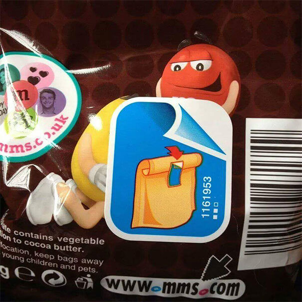
Although poor sticker placement can happen to anyone, the guilty party should have been a little more careful with this one. Unless of course, they were doing it on purpose.
South Korea's Very Inappropriate Playground
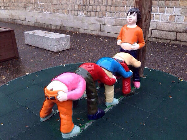
There is probably a perfectly good and innocent cultural reason for this disturbing statue that can be found in South Korea, or at least we hope there is. However, at first glance (and second and third as well) it's hard to see anything other than a very concerning picture. It's probably some sort of hide and seek game, at that's the best guess most people could come up with.
Imgur
Along with the interesting assumed theme of this statue, why are the last child's pants pulled down so low that they are almost about to come right off?
A Special Kind of Before and After
Everyone knows that before and after photos are usually quite deceiving. The before photos are usually taken in poor lighting, with a sad look on the model's face and with poor-fitting or unflattering clothing. The after pictures boast smiling faces taken in bright and sunny lighting with the most attractive outfit choices of all. They truly lead to a deceptive perception of realistic results. This fitness company took things to an entirely new level.
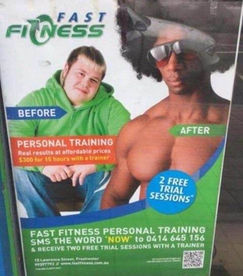
Instead of just exaggerating results like most companies, fast fitness is claiming such incredible results that you could even change your skin and ethnicity with just a simple workout program. Impressive.
The Elevator Light Switch
Once upon a time, a light switch served so many purposes that it confused the living daylight out of people. This light switch was so powerful that it not only could control if the light bulb was turned on or off, but it also had dominion over the elevator. It would make sense that the people in this building would have to write a sign to all the potential light switch users explaining the oddity.
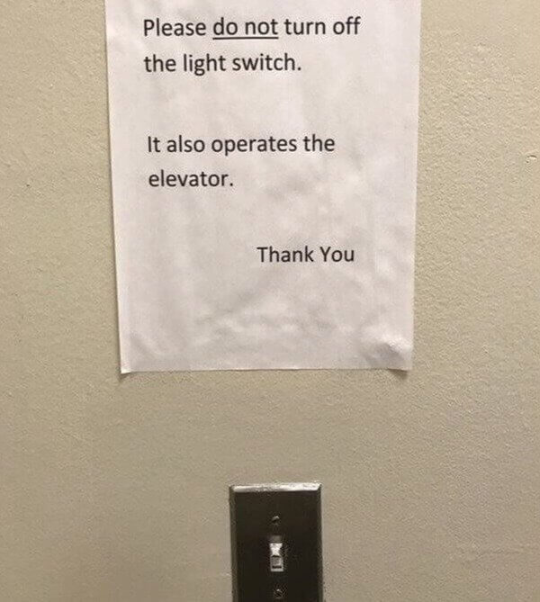
Can you imagine turning the light off and then waiting hours for the elevator that would never arrive? What a strange combination of capabilities, to be in control of both the lights and the elevator.
Die Happily With These Cookies
Perhaps there is no better way to tell your wedding guests what you truly think of them other than to simply write it out on a cookie in plain print. DIE. Taking the sweet with the bitter is maybe their philosophy. It's such a shame to see such beautiful cookies with such an unfortunate design. But the true question is how the original design team missed this subtle hint?
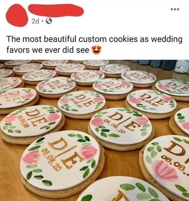
The creator of these cookies certainly had to notice after making one or two of these cookies that there was something just not quite right with the picture. Why did they keep going?
The Not So Innocent Sofa
Hopefully, there is no one who voluntarily chose to buy this sofa and put it as a decorational piece in their home. It's certainly not kid-friendly and it even verges on the side of PG-13 content. The only possible (appropriate) purpose of this interestingly designed sofa would be maybe in a private room at a club or a rentable option for bachelor parties.
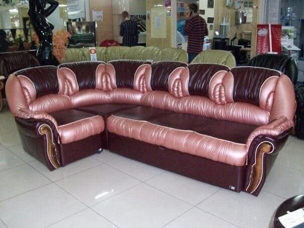
Maybe using lots and lots of pillows is the only option for a way to hide the not so innocent innuendos offered by this sofa. Perhaps if they chose a different color, the imagery wouldn't be so strong.
Not Exactly Sophie's Choice
Well, this is certainly an interesting predicament. The reader of this poster is called upon to decide what is the best course of action for the man in blue. Should he block the path of the train so that it causes six people to die or only five? Regardless it is certainly a terrible choice to make as both of them are far from ideal.
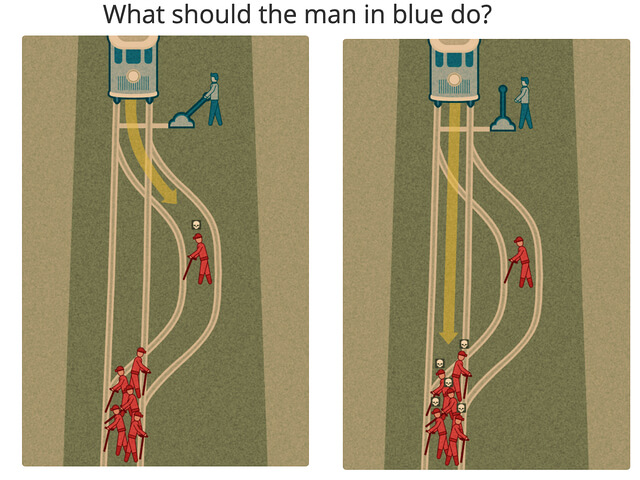
Why couldn't they have made an option where none of the red people in danger would be harmed? No matter what choice you make, the man in blue is going to kill at least five people.
One Very Interesting Playground
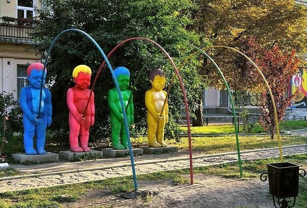
You probably won't notice right away the fact that these colorful statues are not only a strange conformation of baby and adult but also interestingly bedecked in neon mismatching hair colors. No, instead you will almost certainly notice that they appear to all be standing in the identical and very odd positions of urinating in a rainbow of colors. If the colorful urine wasn't strange enough, the fact that you are meant to frolic joyfully underneath their awning should certainly shock you.
Imgur
Although the colors are certainly fun and bright, the strange innuendo of the peeing neon child statue is a little bit off-putting and quite a bit inappropriate.
A Simple Optical Illusion Can Cause Serious Injury
How many people can be injured from one person's simple design mistake? Imagine you're walking along in the park and you get to what looks like a simple ramp bridge. Instead of walking down peacefully on the slight slope, you trip and slide down painfully, bumping down along the painful wooden steps. It's nearly impossible for the plain eye to notice the true nature of this terrible design before it's too late.
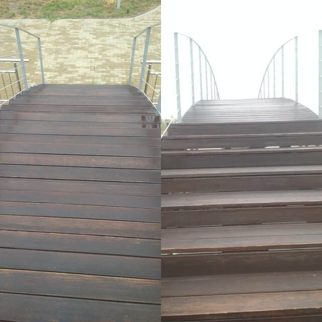
This picture alone should be enough of an explanation for all the people who were injured by this deceiving stair bridge.
Lauren and Her Backwards Books
Lauren is clearly a very visually centered person. Looks are important to her. Everyone can understand her to a certain extent. But when she took it to the extreme of turning and stacking all of her books from the back to the front and thereby hiding all the titles, she may have taken it one step too far. Yes, it may look lovely to maintain the neutral color scheme, but it also defeats the purpose of actually being able to choose a book.
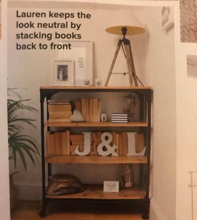
Doesn't it ruin the beauty of individual books by hiding their titles and covers? Maybe a better idea would be to cover them in paper and at least write the name on the side for identification.
Is It a Bench or a Moat?
On a sunny and warm summer day, these benches are surely a welcome convenience for this university's mass of students. People can be seen reading or studying, or just relaxing and sipping some coffee before they rush off to class. Everything is perfect until these poorly constructed benches are faced with a rainy day. Their interesting design slopes backward, offering ultimate comfort until you realize there is no drainage for the water that pools up.

One minor detail seemed to have been forgotten by the designers of these benches. Maybe they thought they lived in the desert, or they liked the idea of a moat-like bench.
A Culture of Homogeneity
Branding is incredibly important when it comes to a long-term marketing strategy. It's essential for people to recognize in a split second a brand, its logos, and its color schemes. However, Google may have taken this idea one step too far. Consistency is key, but no one wants to be confused with nearly identical logos, making it almost impossible to differentiate different apps. It's way too easy to confuse some of these.
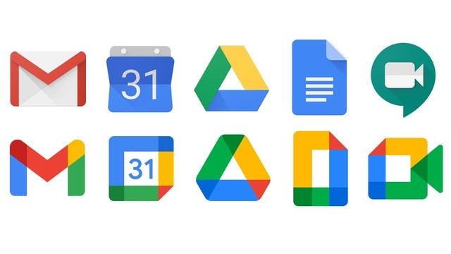
All of the new and improved logos are somewhat easy to differentiate with the clear exception of Google Drive and Google Docs. They are literally almost the exact same logo.
That's One Intense Before and After
What was meant to be a cute and informative image of how a tiger grows from a cute and cuddly little fluff to a large and powerful wild cat, this ad seemed to have overlooked something very important. The original post contained a young lady cuddling the baby tiger, while the picture showing the grown tiger after 10 years suspiciously discludes any human. Instead, you see the tiger chowing down on a big chunk of meat.
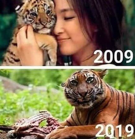
Everyone learned one thing from this infographic (whether or not it was the intended message) and that is to stay far away from adult tigers.
A Window for Just a Sliver of Light
Ah, the interesting and peculiar design choices continue with this strangely slim window situation. Maybe the architects were legally required to include some kind of window in each room, and not wanting to spend too much money on the endeavor, they chose this ultra-thin window. Or perhaps someone was so desperate to have a little bit of sunlight in an otherwise dark room that they specifically added it.
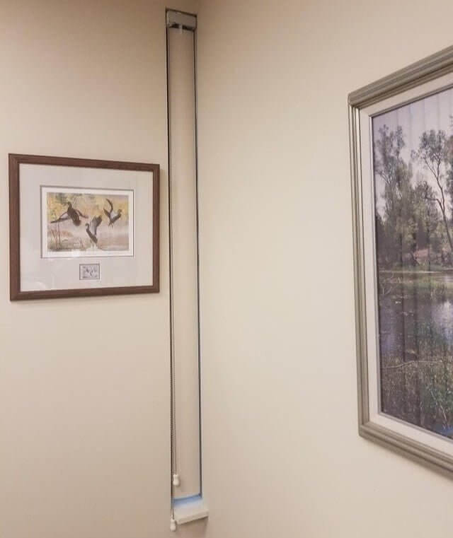
What's more interesting than the window itself is the fact that they were able to somehow find a blind to fit in that exact spot. It had to be custom madeת unless these are more common than anyone suspected.
The Hypocritical Sliding Door Company
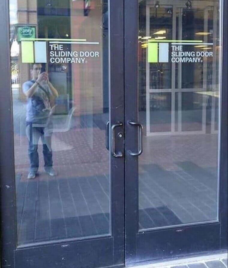
It looks like this sliding door company has a few questions to answer. Does anyone trust a company and its products if they don't even use them themselves? It is a bit concerning by any standards. Even if, for whatever reason, The Sliding Door Company was forced into the contradictory door situation, maybe they should have considered leaving their company name off the outside of the door. It's almost like they're asking for it.
Imgur
There is a chance that the original designers and managers who chose to put the company name on non-sliding doors really just missed the irony of the placement.
The Circular Sign With the Non Circular Message
What exactly is the purpose of the lines connecting the different sets of words if you are not even supposed to read it in that order? And why is there so much empty space in the middle of the image? Everything about the design here is convincing you that it should be read in a circular fashion creating the strange sentence of "love requires knows us to when to be silent and to speak when up".
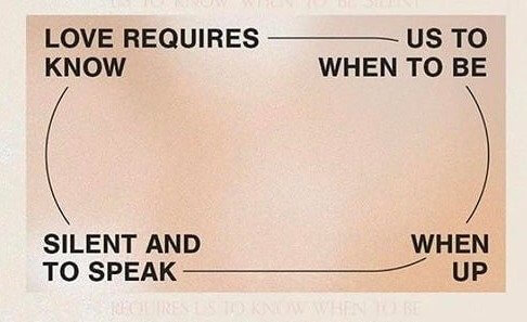
Only after a thorough examination of the words is it able to be understood how it is really supposed to be deciphered. It would have been a nice message if anyone could understand it.
Experience of a Lifetime
It can be said with almost 100% certainty that this is not the original message that this analytics company had in mind for their poster. Unless they were trying a daring marketing tactic of shocking their potential customers, this probably will not have the effect they desired. Although no one will ever forget this ANALystics customer experience, it's probably not for the reason they originally wanted.
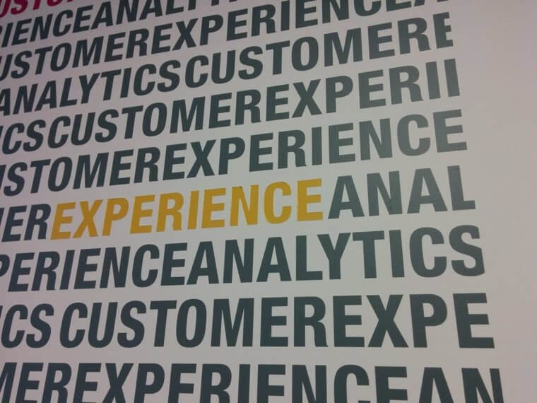
If only they hadn't chosen that specific line to highlight the EXPERIENCE. All of the other rows would have provided a completely innocent message, but the terrible choice of highlighting led to a very different experience than what they offer.
Be Sure to Lift Correctly
Unless you are some sort of gorilla-like human morph, it is unlikely that you would be able to lift anything the way this sign is suggesting. Not very many people are capable of holding and carrying something with one foot and one hand (if that is even what the sign is showing). It looks like this company's budget was pretty low when it came to hiring an artist.
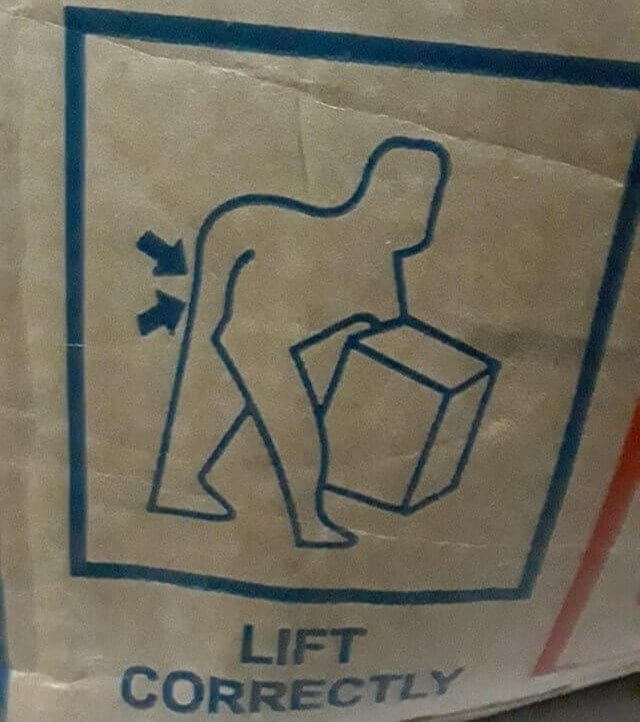
Also, where is the "human"'s other foot, or arm? He is certainly missing something unless the artist of this picture assumes that all people only have three main appendages.
Not so Chic Marble Design
Although there aren't too many people who even consider buying a different color for their keyboards, other than just plain black or white, there is always the option of a marble-like keyboard! However, the designers of this one failed their very simple task and no one wants to think about what this product actually resembles. Imagine having to spend your entire workday typing on what looks like a poo or dirt-covered keyboard.
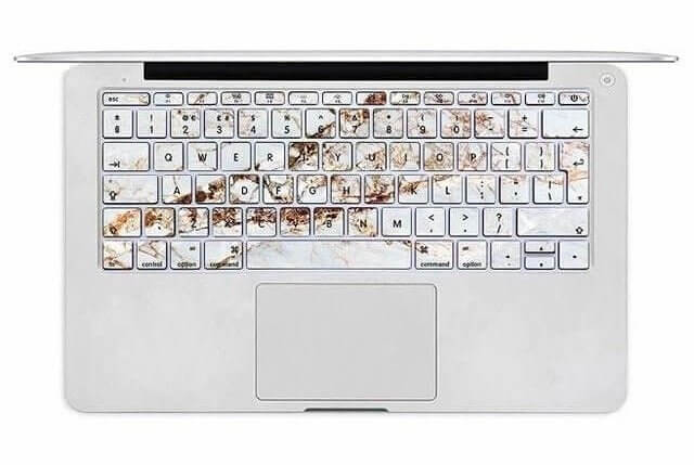
Hopefully, the company has some better marketing images to promote this product because this one simply isn't going to do the trick. It's hard to miss (although the creators seem to have) what this picture really looks like.
The Human Building Health Center
It's really debatable whether this is a disastrous design fail, an incredible design feat, or a total coincidence. Regardless, the Newmarket Health Center is quite impressive with its human-like design. Complete with a little head and long, flailing arms and legs, this building is both comical and amazing at the same time. Who wouldn't want to go to a health center designed and built in the shape of a person?

Imagine you call the health center to set up an appointment and when explaining which ward you are supposed to go to, they simply tell you, "room 110 in the left leg".
The Bike Lane Only for the Courageous of Heart
There may be a very legitimate reason that no one is using the bike lane here. Although all bike riders are eternally grateful for almost any bike paths that the government creates to keep them safe, the designer of this one was most likely an avid hater of cyclists and was overly eager to see them slip and fall to their doom off the side of this dangerous path.
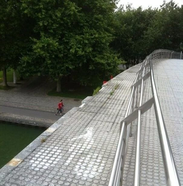
If they had just put the railing on the actual edge of the bridge, rather than halfway through it, both the cyclists and the pedestrians would have been kept safe.
Be Sure to Make It
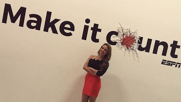
Well, at least it can be said that they get extra points for creativity. They tried to come up with something unique and appealing, even if they failed to see its faults in the final end result. Everyone certainly wants to "make it count" but that is sadly not what people see at first glance. Who would have thought that one simple letter, an "o", would make such a big difference?
Imgur
The woman standing in front of this photo seems to be as clueless and oblivious as the original designers. How is everyone missing the disturbing text and picture in front of (or behind) them?
Plus Size Leggings or Skirt?
Somehow this advertising campaign is both extremely offensive and incredibly stupid at the same time. Instead of hiring an actual plus-size model to wear the plus-size leggings that they are advertising, they chose to use one of their in-house models and have her put one leg of the leggings on, wearing it as a skirt. Besides being super confusing (are they marketing a skirt or leggings), it is very inconsiderate.
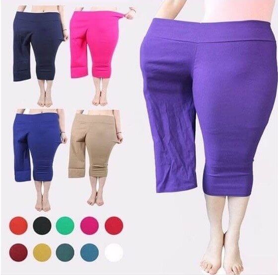
All companies want to save money, but hiring a plus-size model to wear a plus-size product is the bare minimum that must be done when trying to sell a plus-sized product.
When the Sink Is a Slide to the Toilet
What started out as a cheap way to build a sink and a toilet together, quickly slid out of control (pun intended). Imagine putting your toothbrush down on your sink for just a moment, thinking it is perfectly safe, only to turn your back for an instant and see it sliding quickly right into the toilet bowl. It was too late to save it and now nothing is safe from the sink slide.
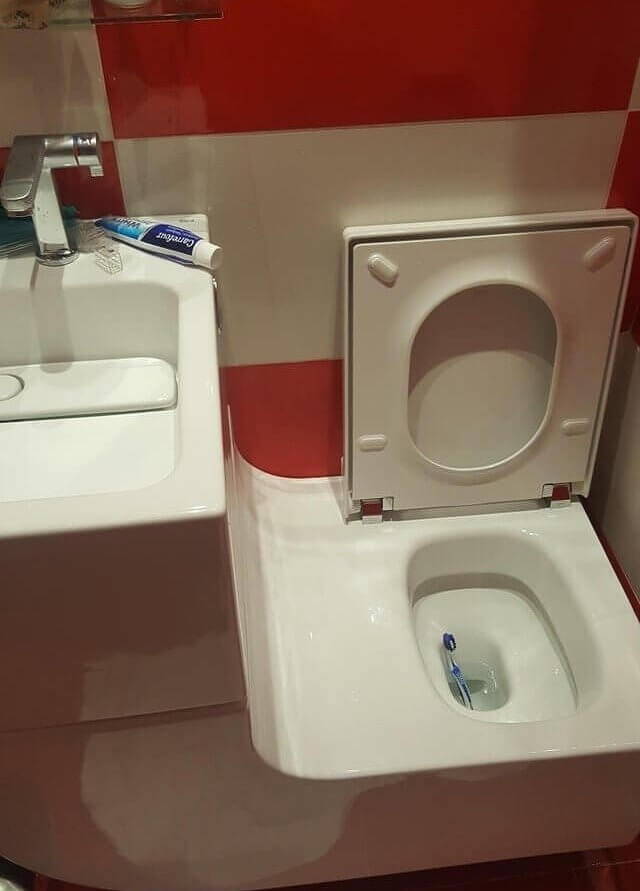
If you ever do get stuck with such a strange contraption in your bathroom, at least consider closing the toilet seat regularly. It could be a simple way to save some objects from the dirty toilet waters.
Extremely Horrifying Playground Design
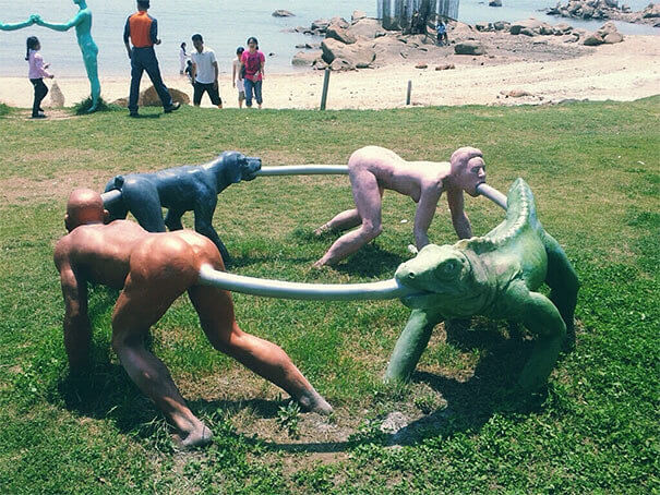
It is unclear whether this is a joke, a terrifying art installation, or truly a legitimate part of a playground. If this really is meant to be a part of a children's playground, what is the game? How did the designers of this miss the extremely prevented message this piece is portraying? There are probably not so many people willing to send their children to this part to play, especially unsupervised.
Imgur
What is the correlation between these creatures anyway? Why combine two humans (as they appear to be) with a dog and a massive lizard in some strange circular game?
Fashion Fart
Very few people think of combining the world of fashion with the world of farts. But, this company whether intentionally or unintentionally, did exactly that. Although it's quite clear that it is meant to say "Fashion Art" the overwhelmingly large "F" standing next to the beginning of both letters, did not quite have that effect. Maybe they didn't have the budget to buy a new sign once they realized their mistake.
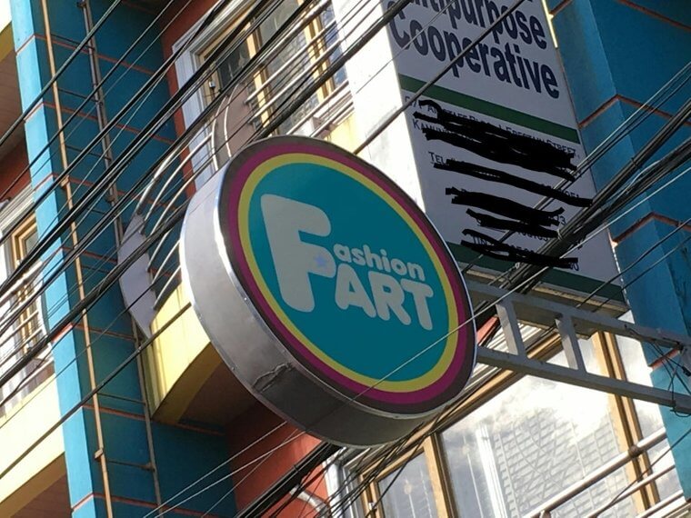
Honestly, the F and the Art are both far too large on their own. Anyone who looks at this sign will not think that the predominant message is fashion, but rather FART.
You Must Really, Really Want That Job
Perhaps this is the ultimate test of an applicant's determination and motivation - to see if anyone will successfully manage to manually type in every number, symbol, and letter in this multiple-paragraph link. It's unlikely that anyone would have the patience to go through the arduous task of typing this mess of a link into a search engine. Did these recruiters not even consider the convenience of a URL shortener for such a situation?
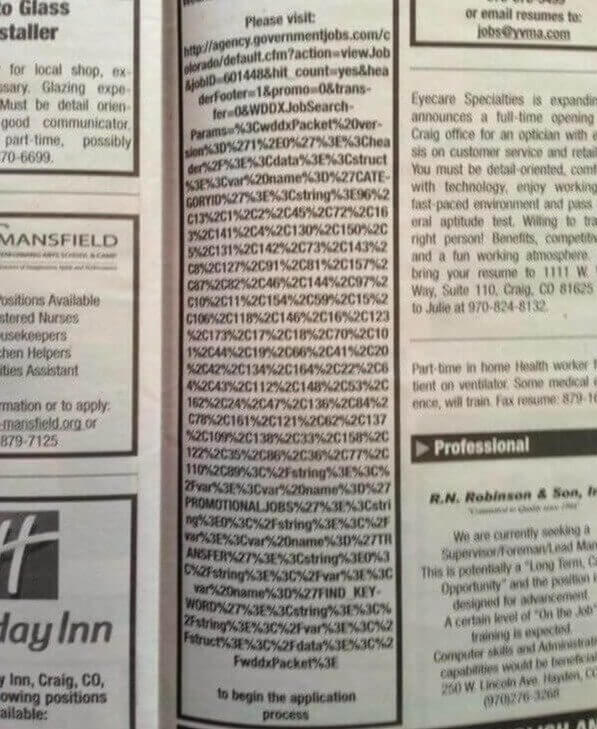
At least if this was online people could just do a simple copy and paste, but because it is actually printed, it's hopeless. No one stands a chance to type all of this is and the recruiters will certainly get little to no applicants.
One Crazy Part of Town
Instead of buying multiple signs to explain the different possibilities of what is going on in this town, why not just buy one? And on that one you can put all the possible warnings you can think of...into one big mess of a statement that makes absolutely no sense. It's the perfect way to keep your neighborhood safe if you like to confuse your potential threats into fear and retreat.

What exactly is the purpose of a sign telling you that people are eating (assuming it's not actually meant to be a sentence together with the "children in the area" part)?
Only Ninjas Can Cross This Bridge
The purpose of a bridge is usually to keep you safe and dry and able to travel across a watery or wet area without getting yourself wet. However, this bridge didn't seem to get the memo (or at least the architects of this bridge). One little storm caused this entire bridge to become a big puddle of water. You have two choices- cross and be soaking wet or turn to ninja-like tactics.
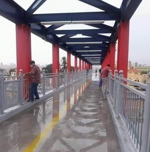
One person certainly started this trend and then all of the others followed suit, thinking that was the best and only way to successfully cross this puddle bridge.
The Difference Between O and Zero
This place must get a remarkably small amount of texts and a disproportionate number of complaints from their customers. Did you notice that that is not two zeros beside the 9 and 1? Most people wouldn't. After all, no one expects there to be a letter hidden in a phone number, it just makes no sense. Either this company had a very poor luck of the draw or they enjoy torturing their customers.

The worst part is that they don't even offer an alternative way to contact them, besides this confusing number and letter combination. They must have to deal with so many angry customers.
The Wheels That Never Stop
Apple has released a new product, offering wheels for the Mac Pro. What's the only downside? These pricy wheels (around $550) don't have any ability to break. What does that mean? They will just roll and roll and roll perpetually. Your Mac Pro may be right by you one minute and then you'll turn around for a second and it will have rolled all the way over to your coworker.
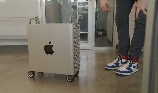
People expected more from Apple, especially with such an expensive product. This seems to be more of a potential risk to your device than it is worth the possible convenience.
